Marco Pessotto
The bookbuilder: a tutorial
Introduction
With the Bookbuilder you can customize the PDF and the EPUB of the texts distributed on an amusewiki instance. You can change fonts, dimension, etc. This article will cover the Bookbuilder feature in great detail. Anyway, the web interface should already give you an idea of what you can do.
Getting the texts into the bookbuilder
The prerequisite is that your browser has javascript and cookies enabled (otherwise the application can't store your selections).
To start using the Bookbuilder you first need to add one or more texts.
We will start covering the topic of a single text and all its options.
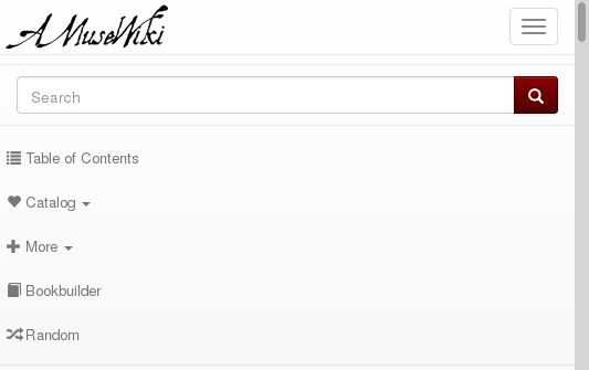
The Bookbuilder can be found on the navigation menu, with a book icon.
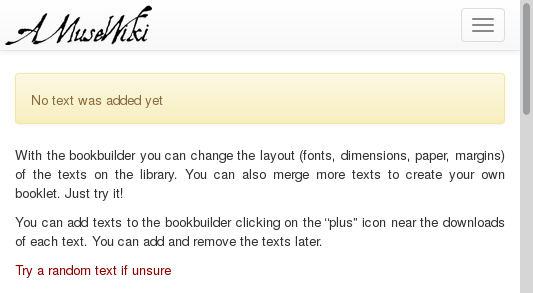
However, following the link will tell you that no texts has been added yet.
If you haven't already done so, you will have to pass the antispam question before proceeding.
So, find a text (/random could do for the purpose of this tutorial) and look at the download buttons. The last two buttons with a big plus sign are the Bookbuilder buttons.
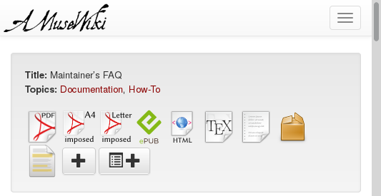
The first one is to add a whole text, the second one (with a list icon) is for selecting individual parts (this topic will be covered later).
Clicking on the plus button will add the text to the Bookbuilder.
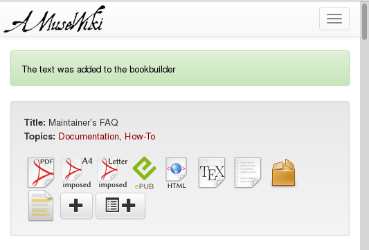
You can continue browsing the site or visit the /bookbuilder page now, clicking the link in the navigation menu or the confirmation message.
Normally your selections are kept until you close the browser, and sometimes even longer (depending on the traffic on the site, if you clean the cookies, etc.). But let's assume they are kept while you don't close the browser, so you can browse the site freely, add more texts, and finally come back to build your files.
The Bookbuilder interface
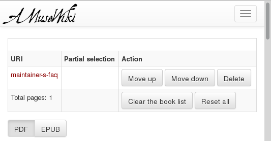
The upper part of the page consists of a table which lists the texts added so far. You may want to browse the site and and more texts if you wish so, but for now let's stop here and see what the Bookbuilder has to offer.
Given that so far we have only one text, the “Move up” and “Move down” buttons have no use. Deleting a text will remove it from the Bookbuilder. “Clear the book list” will remove all of them, while “Reset all” will clear the list and restore the factory settings.
The first choice to do is the output format, which usually is PDF or EPUB.
PDF options
Feel free to experiment with the options. After you have built a text, the options are not lost, you can go back to the Bookbuilder page and rebuild the PDF changing some other options until you achieve the desired result.
Fonts
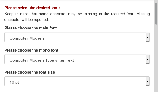
First of all, you may want to change the fonts used in the PDF. There is a link to the font preview page, /bookbuilder/fonts, with the title “Please select the desired fonts”, where you can take a look and see how they look likes and if the character coverage is enough for your text (which should be enough for Latin characters, but it's a more delicate matter for, e.g., Russian).
The main font is what matters, while the mono font is relevant only for code listings.
Finally you can choose the font size, in the standard 9, 10, 11 and 12 points. Usually 10 or 11 is a good choice.
Page dimensions
The paper format choice is, of course, an important one and determines the page dimensions, before any other processing like imposition.
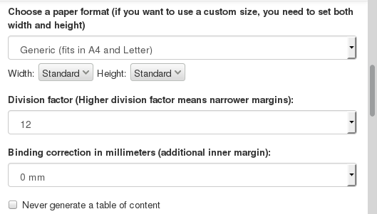
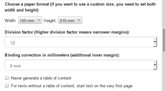
The menu consists of a dropdown menu with predefined dimensions (mostly standard) but also offers a way to set custom ones. Please note that to use the custom dimensions you need to set both the width and the height, otherwise the dimensions set in the dropdown menu takes precedence. When both width and height are selected, the dropdown will disappear, and will reappear resetting the dimensions to “Standard”.
The division factor and the binding correction
The options presented here is probably cryptic, but it has a sane default. This is the way the text block is built:
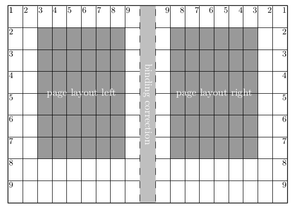
The grid presented here shows a page built with a division factor of 9. The width and the height are divided in 9 equal parts, and 3 parts are used for the margins. Increasing the division factor leads to narrower margins, because it will always use 3 parts for the margins, while the text block would grow. More details can be found in the documentation of the backend used, KOMA-Script. The menu offers division factors from 9 (wide margins) to 15 (narrow margins).
In the picture you will notice the binding correction gap. That is the amount of space eaten by the binding. If you are clipping a booklet, you may want to set it to 0, while if you're binding it, you have to take account of the paper that gets used by the binding, which is not visible at all and in the worst case scenario could make you book unreadable because the binding would eat the text as well (and then you can throw everything away...).
Table of contents options
Under normal circumstances, a text with sections or chapters generates a table of contents. However, you may want to disable it (to save paper or because you feel it's not needed): you can do so checking the “Never generate a table of content” checkbox.
If, instead, the text does not have sectioning, by default the text will start on the next page after the cover. Checking the “For texts without a table of contents, start the text on the very first page” checkbox would make the body starting at page 1.
Two side layout
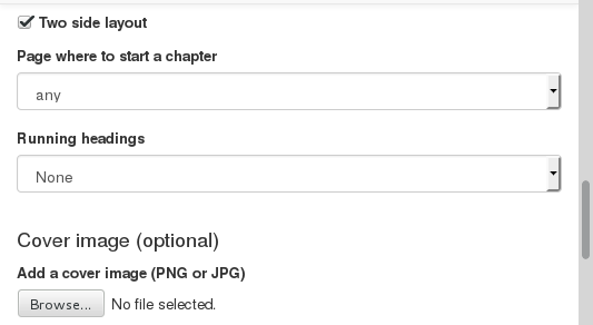
This apparently innocent checkbox means a great deal.
If not checked, the text block would be centered, with equal left and right margins, and centered page numbering.
If checked, the layout will take account of left and right page, the inner margin being half of the outer margin, and page numbers on the outer margin. Also, a dropdown menu will appear, asking where to start a chapter, if on any page, or on a right-hand page only.
If you are going to produce a PDF for reading on screen, you want to choose reduced page dimension (A5 max), disable the two side layout and set the binding correction to 0.
If you are going to do a booklet or a book, you want to activate the two side option.
Running headings
The running headings, also known as headers, are the lines with usually author or title or section name which can be found on the top of a page.
Now, deciding what to put there can be tricky, because a random text doesn't have a fixed structure with sections and chapters, or the subtitle is missing, or the author is missing, so the dropdown menu prompts to some choices, also stating what happens if you do not have a two-sides layout (because usually you don't want the same text on the left header and on the right header).
Choose the safest option which works for your text.
The cover image
A word of warning: usually it's best to let the Bookbuilder take care of the inner of the book or booklet, and create the cover on a different file, because usually you want to print it on a different kind of paper, add some texts on the backside, etc.
Anyway, if you are going to produce a file to distribute on the internet for reading on screen, and you want some graphics on it, you have the chance to do so adding a cover image.
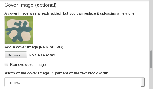
You can get a preview of the file by selecting the file from your computer, scrolling down the page and hitting “Update”, which will save your settings.
Once you have uploaded it, you have the chance to replace it selecting another one or remove it checking the appropriate checkbox and updating again.
Another warning: the image by default will expand its width to the text-block width (i.e., will have margins). Now, if the width/height ratio is not suitable, it's possible that some undesired results will follow, like the image going on the next page and so.
To control the image size you can set the width in percent. So, if the image is too high, reduce the width to a suitable size to make all the cover material fit nicely in the page. You will probably have to rebuild a couple of times.
Again, probably you want to create a cover yourself on a separate file.
At this point, if you are not going to print the file or if you are just printing on a plain A4, all you have to do is to press the “Build it” button on the bottom of the page.
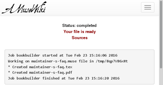
The link under ”Your file is ready” is the file for you, but you can also grab the LaTeX sources and attached files with the “Sources” link.
Imposition
If you don't know what imposition means, you can read about it on wikipedia.
You can activate the imposition clicking on the “I want an imposed (ready to print) PDF” checkbox, and you will be presented with a wide range of schemas. Every schema is accompanied by an image which should make the output clear.
Be aware that the page dimensions you set before are altered. If in your schema on every sheet fit two pages, the width will double. So, if you set the page dimensions to A5, if you impose with the 2up schema, you will get a final physical size of A4.
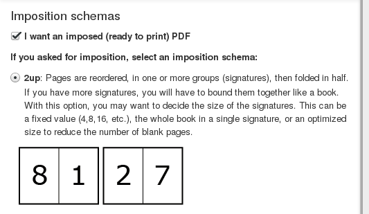
The contextual help should be clear enough. If not so, please report it as an amusewiki bug.
If you are going to print a pamphlet, you want the 2up schema, which also prompt for the signature size, defaulting to imposing the whole book on a single signature, meaning that the last page will be together with the first page on the first physical sheet. All you have to do is to clip in the middle, fold once and you have your booklet.
Anyway, you can also set the signature size, i.e. imposing the text in more booklets which then you have to bind together.
While most of the schemas have fixed signatures, the 2up and 4up schemas can have different signature sizes.
As we said, the default is to impose everything on a single signature. However, for larger books, this is not always desirable. You can set it to a fixed number of pages you decided, or let the system to compute the best signature size (i.e., the one which will generate less blank pages to fill the last signature). This is the "optimized signature" option. All the signatures will have the same size, but this size is not known in advance, and will be ranging from 40 to 80.
Again, feel free to experiment.
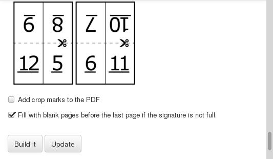
Also take a look at the checkbox at the bottom of the page: “Fill with blank pages before the last page if the signature is not full”. Say your book is going to have 10 pages, and you impose on a signature of 16 pages, this means you are going to have the 6 pages blank. If this checkbox is not checked, the blank pages will fall at the end. If you fold it, the last page is going to be empty.
However, given that amusewiki produces PDFs with a kind of back cover, it's nice to have it placed at the very end. So, in our example, pages 1-9 with the text, then pages 10-15 with blank pages, and finally page 16 with the original last page (which was p. 10, but now is shifted at the end). And this is what that option does.
Crop marks
Checking the “Add crop marks to the PDF” will reveal some other options.
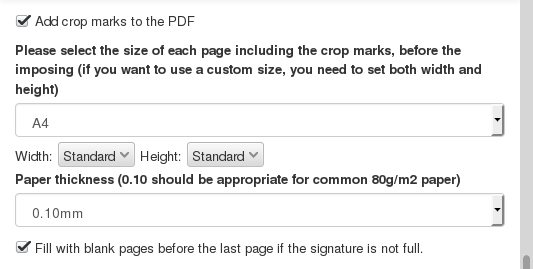
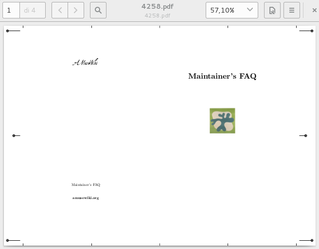
Crop marks are the marks placed at the corners of a form to indicate where the page is to be trimmed.
If you are not going to trim the paper, you don't need it.
When using this option, please note that you are now setting the size of the logical page, not the physical paper dimensions. So the same logic as before, when we were setting the page dimensions apply.
Say you want to print a booklet with dimension 13x20cm, using the 2up schema. You have to set the 130mm and 20mm when you choose the page dimension, while here you should set A5 (so it leaves some margins to cut), and will result in an A4 PDF.
Activating the crop marks also cause the cutting correction to be applied, so outer pages in the signature will have some inner space to compensate the paper thickness after the folding. You can fine-tune that with the “paper thickness” dropdown menu.
Be aware that the file needs some more time to be produced when you activate the crop marks.
EPUB
Now that we got our first PDF, we can go back to the /bookbuilder page and instead of choosing PDF, we can choose EPUB. Please note that the PDF settings will not be forgotten.
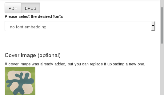
When choosing the EPUB output, most of the options will disappear, leaving only the cover image options (same logic as the PDF) and an EPUB-specific option, which permits to embed fonts into it.
Please note that not all the devices and software which read EPUB support the font embedding, and the size of the EPUB with embedded fonts is going be much larger.
Anyway, if you want to create a nice EPUB with fonts of your choice, you have the chance to do so.
Again, refer to /bookbuilder/fonts for a preview.
To create the file, hit the “Build it” button as we did for the PDF.
Collections
Amusewiki has the ability to merge texts together. You just have to add another text to the bookbuilder, with exactly the same procedure as before (the plus button on each page).
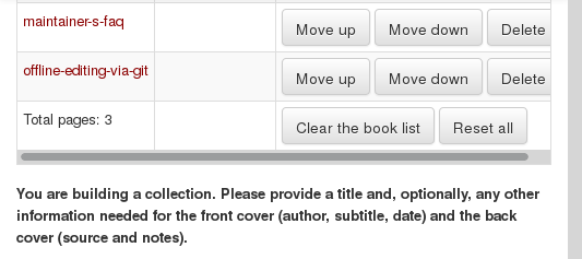
However, when building a collection, you are asked for some details. The only mandatory one is the title of the collection, but you can also specify author, subtitle, date (for the front page), source and notes (for the back page).
This gives you full control of what to put on those pages of the resulting file (both EPUB and PDF).
Partial selections
You can also choose to add only some sections of a text.
You can do so visiting the text and in the menu, and clicking instead of the plus button, the plus button with a list, which brings you to a new page where the text structure is shown and you can pick the pieces you are interested in.
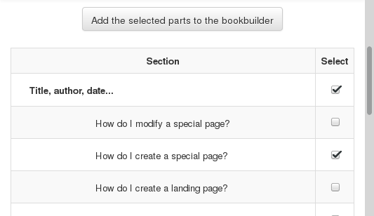
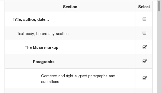
Beware that when you have a complex structure, if you select only an higher level (in the example here, “The Muse markup”) without the lower levels, you are going to get only its title and the text until the first subsection. Anyway, the interface is going to select the subsections for you when you select an higher level. You are free to deselect them if you are not interested in those parts.
Clicking on the “Add the selected parts to the bookbuilder” will bring us back to the text, with a notice that we have added it.
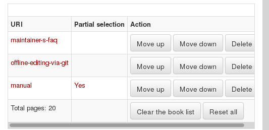
If you now visit the /bookbuilder page, will see a link in the “Partial selection” column (with a “Yes”). If you visit it, it will bring you back to the text structure view, where you can edit and resubmit the selections.
Please note that doing so will add the text again (yes, you can have duplicates), so you have the remove the previous copy with the “Delete” button. New additions are naturally added at the bottom.
The rest of the interface works transparently as you were building a single text.

